I have said for many years that a well designed job board goes a long way towards helping your sales and gaining new users. Recently the folks at niche job board CoolWorks, which features adventure/outdoor type jobs around the USA underwent a redesign and I thought it was a great example of job board web design.
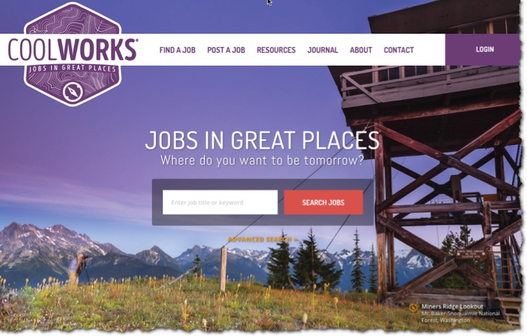
The new home page features visual new cover images that rotate, a fabulous new header area that integrates the logo into the main navigation and a clear call to action (search jobs). I love how they color the login button off the main nav in purple to make it stand out.
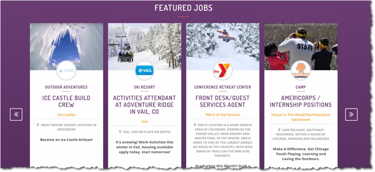
Scrolling down reveals featured a list of featured jobs that can be scrolled horizontally. Notice how visual they are. I think all job listings should have a photo that sells the role and CoolWorks does a great job with “visual” job postings.
Once you click into the site through a job search I did find one issue with what they did. Too much white space. The area that displays my keywords takes up way too much area and pushes job results down too far. They should squeeze the keywords onto a single line. It looks like the “Save This Search” box may be the cause of this but I would recommend looking at a different way to implement that feature so it is more linear.

They also do a great job curating user generated content through their “Journal” section where people write about the cool jobs they get through the site.

There is lots to admire about their new redesign. Other job boards should be jealous. It looks like they built site using WordPress. A lot of job boards online now have let their sites get old and gray. But CoolWorks is one of the leaders in our space that just keeps getting better.
The post This niche board just launched a beautiful new redesign appeared first on Job Board Consulting - job board consultant.